Case study: turning eight building systems into one interactive floor for WurkSpaces
The short answer
WurkSpaces is a commercial office fit-out contractor in Hyderabad. We built a site that explains a fit-out by letting the buyer explore one: an interactive floor where eight building systems light up one at a time, placed inside an argument that ends in one contract and one plan. Scope, timeline and results stay as [Confirm] until verified.
On this page
- The short answer
- At a glance
- What problem did the WurkSpaces site need to solve?
- How is the site structured as an argument?
- How does the eight-systems floor model work?
- Why greyscale photography, light and dark modes, and keyboard access?
- What did we deliberately leave out?
- What can other service businesses take from this project?
- What to do next
- What to take away
- Questions, answered
An office fit-out is one of those purchases most business owners make once or twice in a career. They know they need a working office. They rarely know that a working office is eight separate systems, each with its own trade, and that the hard part is what happens between them.
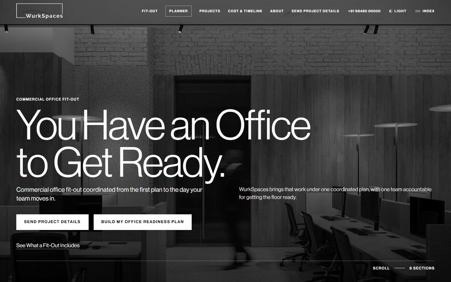
WurkSpaces is a commercial office fit-out contractor in Hyderabad. Our job was to build a site that explains that reality to someone who has never bought a fit-out, and makes one contract feel like the obvious choice. You can see the summary on our WurkSpaces work page.
At a glance
- Client: WurkSpaces, commercial office fit-out, Hyderabad
- What we built: an interactive eight-systems floor model, a starting-point picker for four kinds of floor, an Office Readiness Planner entry point, greyscale photography with light and dark modes, keyboard-operable interactions
- Platform: Next.js, animated with GSAP
- Scope and timeline: [Confirm]
- Results: [Confirm with the client]
What problem did the WurkSpaces site need to solve?
The site had to explain a fit-out to an owner who has never bought one, then make a single coordinated contract the sensible answer. Buyers in Hyderabad's office districts often arrive thinking in terms of furniture and interiors. The real scope includes air conditioning, cabling, fire safety and controls, and the risk sits in the handovers.
A typical services page would list those trades in a grid. That tells the buyer what you do. It does not tell them why it matters that one team does it. We wanted the page to make the argument itself, in the order a buyer would need to hear it.
So before any design, we wrote the argument down. Five steps, each one a section with a single job. That decision shaped everything that followed.
How is the site structured as an argument?
The page reads as one argument in a fixed order: your floor, what it needs, eight systems, one plan, real floors. Each section answers the question the previous one raises. A visitor who stops after any section still leaves with a complete thought, and a visitor who reads to the end arrives at the enquiry with the case already made.
The WurkSpaces page, read as an argument
- Your floor: You have an office to get ready
- What it needs: Four starting points
- Eight systems: The interactive floor
- One plan: One contract, one lead, one date
- Real floors: Delivered work, figures to verify
The hero opens on a plain line, "You Have an Office to Get Ready.", with two actions: send project details, or build an office readiness plan. A quieter link offers to show what a fit-out includes, for the buyer who is not ready to commit.
The second section asks what the floor needs and offers four starting points: a bare shell, a warm shell, an existing fitted office, or an occupied renovation where the team keeps working. Each one changes the requirement, and the copy says so plainly. Beside them, a panel points to the Office Readiness Planner, which works through the questions to answer before a fit-out starts. The site states that the result can be printed or shared internally and that no sign-up is needed.
How does the eight-systems floor model work?
The floor model is a photograph of a working office with eight numbered markers placed on it. Selecting a marker lights the part of the floor that system builds and shows a short description with a hint on where to look. A "Light all 8" control shows every system at once, under one line: one contract, every system on this floor.
The eight systems, as the site names them:
- Furniture and interiors
- Ceilings, floors, lighting and power
- Air conditioning
- Meeting rooms and screens
- Internet, cabling and phones
- Smart controls and sensors
- Security and fire safety
- Branding and signage
Below the model, the same eight appear as a plain list with one-line descriptions. That matters for two reasons. A visitor who does not want to interact still gets the content. And search engines and AI assistants, which read text far more reliably than they interpret interactions, can find and quote the full scope.
The section after the model is titled "The difficult part is what happens between them". That is the commercial point of the whole page. The model shows the parts; the next section explains the cost of coordinating them separately.
Why greyscale photography, light and dark modes, and keyboard access?
These were decisions about attention and access, not style. Greyscale photography keeps the eye on the numbered markers rather than on furniture colours. Light and dark modes respect how people browse. Keyboard-operable interactions and a skip link mean the model works for visitors who do not use a mouse, which an interactive centrepiece must.
Interactive features often fail the people who need them most. A floor model that only works with a mouse hover would have locked out keyboard users and many phone users. We built each marker as a real control, so it can be reached and activated without a pointer, and the plain list below repeats the content for anyone who prefers to read.
On a phone, the argument holds its order in a single column. The markers stay tappable, and the descriptions sit close to the image rather than in a side panel.
What did we deliberately leave out?
We left out claims the client could not yet prove. The "Real floors" section shows delivered projects, and any figure not yet verified is marked "to verify" on the live site. The site also says plainly that the commercial brand is new, and that the delivery experience behind it comes from the established studio it grew from.
This is what we mean by evidence, not adjectives. A new brand is tempted to borrow certainty it has not earned yet: rounded-up square footage, project counts, a promise of speed. Each of those is a liability the first time a buyer checks. Marking a figure as pending tells a careful buyer that the rest of the page can be trusted, and it gives the client a clear list of facts to confirm. The next steps we have noted for this project are verified project figures and search visibility for fit-out searches in Hyderabad, both [Confirm].
What can other service businesses take from this project?
Any service with many invisible parts can use the same method. Write the argument as numbered steps, give each section one job, then find the one thing a buyer cannot picture and make it visible. For WurkSpaces that was the floor. For a clinic it might be the first appointment; for a school, the admissions path.
The pattern travels well beyond fit-out. An IT services firm can show where each layer of a network sits in an office. An architect can show which decisions are made at which stage of a project. The test is simple: if a buyer has to take your word for the scope, the page is asking for trust it has not yet built. If they can see the scope, the trust comes from the evidence. We wrote more about this habit of deciding first in built on intent: why every page should have a job, and about the brief that comes before design in the one-page brief.
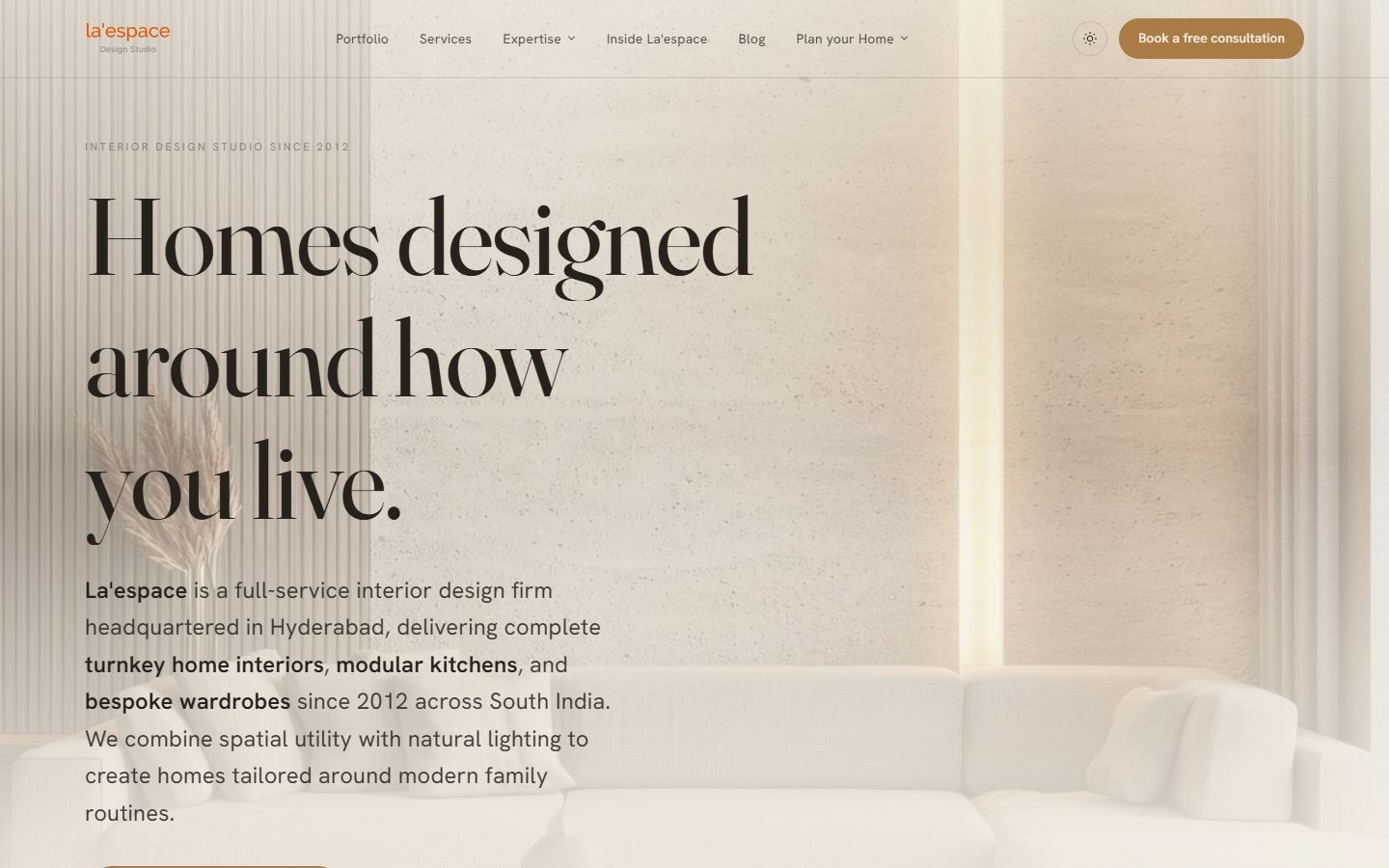
For a sister project from the same studio family, see our case study on LaEspace, a website for a studio that designs complete homes. For the wider sector view, read websites for interior designers and architects.
What to do next
If your service is hard to explain, start by writing the argument in five lines, one per section, before you think about design. Then mark every figure you cannot yet prove.
If you would like help shaping that argument into a site, see how we approach websites and platforms and technology decisions, browse more of our work, or book a call. We work from India with businesses across Hyderabad and Telangana, the UAE and the UK.
What to take away
- A complex service sells better when the buyer can see its parts, not just read a list of them.
- The site is written as an argument in five steps, so every section has one job.
- Unverified project figures are marked 'to verify' on the live site rather than rounded up.
- Greyscale photography, light and dark modes and keyboard access were decisions, not decoration.
Built on Intent studio. A founder-led studio in India that plans and builds websites, search and AI visibility, and AI systems for businesses in India, the UAE and the UK. Reviewed by [Founder name], founder. We do not publish invented numbers; where a figure appears, its source is named in the sentence.
How the studio works