Case study: one campaign page and one full college site for AURA
The short answer
AURA is an education group in Hyderabad. We built two things for it: a campaign landing page with one job, booking counselling sessions, and a full degree-college site where families compare BBA and BSc programmes, explore global pathways, download a brochure and enquire. Both share one line, 'We Create Personalities.' Scope, timeline and results are [Confirm].
On this page
- The short answer
- At a glance
- Why build a campaign page and a full site separately?
- How does the AURA campaign landing page work?
- What does the full AURA degree-college site include?
- Why keep call and WhatsApp buttons on screen for a Hyderabad college?
- How do the two builds stay consistent?
- What are the noted next steps for AURA?
- What can other colleges take from AURA's two builds?
- What to do next
- What to take away
- Questions, answered
A common mistake in admissions marketing is sending every campaign to the home page. The home page has to serve everyone: a parent checking fees, a student comparing courses, an alumnus looking for a contact. A visitor from a campaign arrives with one specific interest and finds twelve options.
AURA is an education group in Hyderabad. We built two things for it, each with a single job. The brief: fill counselling sessions from a campaign, then give families a full site to compare programmes and apply. You can see the summary on our AURA work page.
At a glance
- Client: AURA, business education, Hyderabad
- Build one: a campaign landing page for Aura Global Business School, built to book counselling sessions
- Build two: the full AURA Degree College site, with programmes, Global Pathways, the AURA Advantage, campus life, a brochure download and an enquiry form
- Shared: one line, "We Create Personalities.", with shared type, colour and voice across both
- Platform: [Confirm stack]
- Scope, timeline and results: [Confirm] and [Confirm with the client]
Why build a campaign page and a full site separately?
Because they have different jobs. A campaign page speaks to visitors who have already shown one interest and asks for one action. A full site serves families at every stage of a decision and must answer many questions. Combining them produces a page that asks too little of the ready visitor and explains too little to the careful one.
Two builds, two jobs
Campaign landing page:
- One audience: visitors from a campaign
- One action: book a counselling session
- Key facts as four short tiles
- Founder section and eight reasons
- Philosophy in two short lists
- No menu maze, few exits
Full degree-college site:
- Every visitor, at every stage
- Apply Now and Download Brochure
- Programme cards for BBA and BSc
- Global Pathways and the AURA Advantage
- Campus life, a day at AURA
- Enquiry form, call and WhatsApp buttons
This is what we mean by building on intent. Before design, each page gets a written job. For the landing page, the job is a booked counselling session from a campaign visitor. For the college site, the job is a confident enquiry or application from a family that has compared its options. Every section on each page is judged against that job.
How does the AURA campaign landing page work?
The landing page opens on "We Create Personalities." with a short line about real skills, real confidence and real careers. Its primary action is "Book a Counselling Session", with a secondary option to visit the campus. Four tiles beneath give the facts a campaign visitor wants first. Everything below supports that one booking.
The page then moves through a short sequence. A founder section introduces the person behind the institution in her own words. Eight cards set out the reasons the school gives for choosing it: an industry-aligned curriculum, corporate mentors, AI applied across the curriculum, an internship-based model, international progression paths, placement support, international learning tours and startup guidance. A philosophy section closes the argument in two short lists, what students develop and what the school believes.
One line on the page carries the whole position: the school says it does not train students to pass exams but to perform, communicate, lead and adapt. A campaign visitor who reads only that line understands the offer.
The navigation is deliberately short: programmes, advantage, campus, contact. A campaign page with a full menu invites visitors to wander off before they have decided.
What does the full AURA degree-college site include?
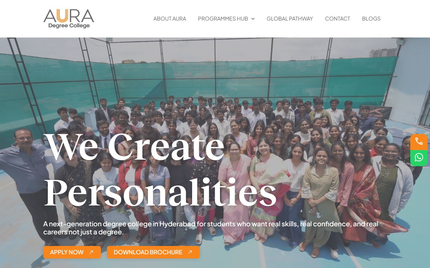
The full site at aurabschool.com serves families comparing colleges. It opens with a group photograph of students, the same line, and two actions: Apply Now and Download Brochure. Programme cards, Global Pathways, the AURA Advantage, a day at AURA and an enquiry form follow, with call and WhatsApp buttons fixed to the side of the screen.
The programme cards cover the BBA tracks, General with an entrepreneurship focus, General with HR, marketing and finance, and Business Analytics, along with a BSc in Artificial Intelligence and Machine Learning. Each card says in one sentence who the programme is for, then links to more detail.
Global Pathways sets out the options plainly: complete the bachelor's degree in India, take a 2+1 route that finishes the final year abroad, or a 2+2 route into a bachelor's and master's. The AURA Advantage repeats the reasons from the landing page in fuller form and adds one local point: the campus location in Banjara Hills. A day at AURA lists what campus life involves, from classrooms and labs to presentations, mentoring and sport.
Why keep call and WhatsApp buttons on screen for a Hyderabad college?
Families in Hyderabad, as across India, often prefer to ask a quick question on WhatsApp or by phone before filling in a form. Keeping both buttons fixed on screen meets that habit on every page. The enquiry form remains for families who prefer it, and the brochure gives parents something to share with relatives.
Admissions decisions for degree colleges in Telangana are rarely made by one person. A student shortlists, a parent checks, an uncle in another city has an opinion. A brochure download and a WhatsApp button both travel well in a family group. The site is built for that conversation, not only for the individual visitor. Following up those conversations quickly is its own discipline; we cover it in automating lead follow-up without losing the personal touch and WhatsApp AI reception.
How do the two builds stay consistent?
They share type, colour and voice, and the same line opens both. A family that books a counselling session from the campaign page and later visits the full site should feel they are in the same place. On a phone, both builds keep the main action within the first screen, so neither asks the visitor to scroll before deciding.
Consistency here is practical, not cosmetic. If the campaign page and the college site looked like two different institutions, a parent might reasonably wonder which one was real. Shared voice also means the admissions team can use one set of answers across both, which keeps counselling calls simple.
What are the noted next steps for AURA?
The next steps we have noted are programme pages shaped for search and AI answers, and admissions results once the college shares them, both marked [Confirm]. Until then, this case study describes only what the two builds show. We do not estimate enquiries, counselling bookings or conversion rates for a client.
The search step matters because families now ask AI assistants questions like which colleges in Hyderabad offer a BSc in AI, or what a 2+1 pathway means. A programme page that answers those questions in its first paragraph, names the programme exactly and states who it is for is easier for Google and AI assistants to quote. The cards on the full site already follow that shape in miniature; the fuller pages would carry it through. Our guide to answer engine optimisation explains how.
What can other colleges take from AURA's two builds?
Decide what each campaign is for before you build anything. If a campaign has one action, build it one page with one action. Keep the full site for the comparison work: programmes, pathways, campus life and fees. Then join them with shared voice, so the family's journey from one to the other feels like a single conversation.
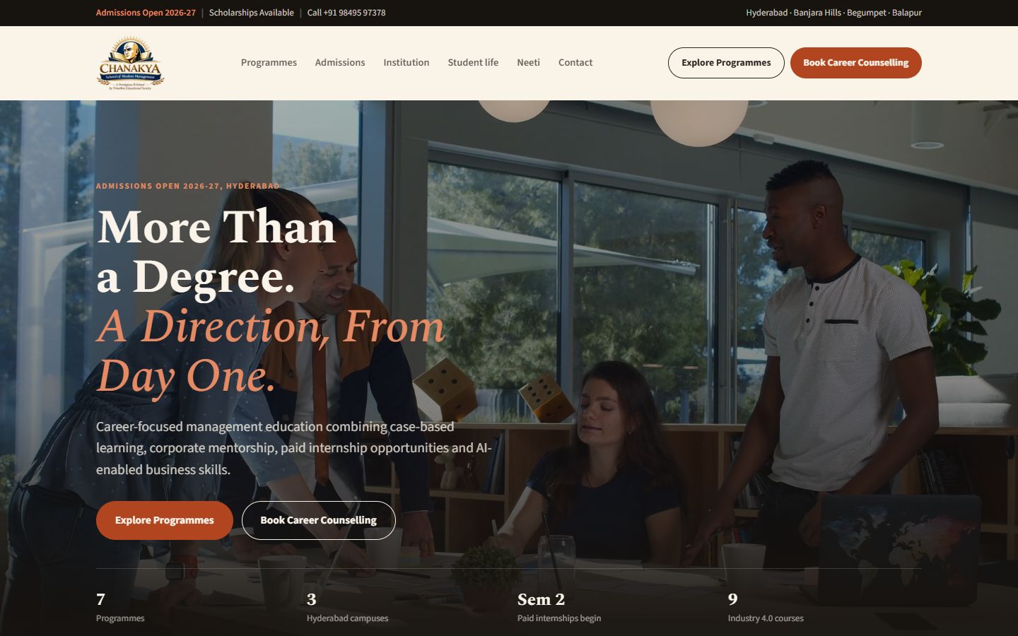
For a contrasting approach to the same audience, see our case study on Chanakya's evidence-first business school site. For the sector view, read school and college admissions websites in Telangana.
What to do next
List every campaign you plan to run this admissions season and write the single action each one should produce. If two campaigns share an action and an audience, they can share a page. If not, they need their own.
To talk it through, see how we approach websites and platforms and AI systems and automation, browse our work, or book a call. We work with colleges and schools across Hyderabad and Telangana.
What to take away
- A campaign page and a full site have different jobs, so they should not be the same page.
- The landing page has one action, a counselling session, and everything on it supports that action.
- The full site answers the comparison questions: programmes, pathways, campus life, brochure, enquiry.
- Shared type, colour and voice let a family move from one to the other without feeling they changed brands.
Built on Intent studio. A founder-led studio in India that plans and builds websites, search and AI visibility, and AI systems for businesses in India, the UAE and the UK. Reviewed by [Founder name], founder. We do not publish invented numbers; where a figure appears, its source is named in the sentence.
How the studio works